The importance of selling your PRODUCT vs selling your brand at Costco
- The Costco Packaging Guys

- Aug 1, 2020
- 2 min read
Costco commonly sells 1-2 brands of any 1 product.
In a typical grocery store for example, customers are often faced with 10+ different brands and types of the same product.

Why is this important to selling your product successfully at Costco?
In typical retail, you want to sell your brand since customers are loyal to brands especially when faced with a multitude of choices. When faced with far less choices at Costco, you need to ensure members see, understand, and are impacted the packaging of your product and value proposition. Brand is of 2nd importance and here's why:
In the Costco Warehouse "treasure hunt", products often move locations around the warehouse and come in and out of availability. Although most of us would find this annoying if our local grocery store did this from week to week, it's part of Costco's success. Costco wants you to walk the aisles and discover new products.
As marketers of products, and designers of packaging, we need to ensure members see and understand your product and value proposition. Always think "does this meet Costco's 5x5 rule; that a member needs to understand from 5' away, and in 5 sec, why they need to buy".
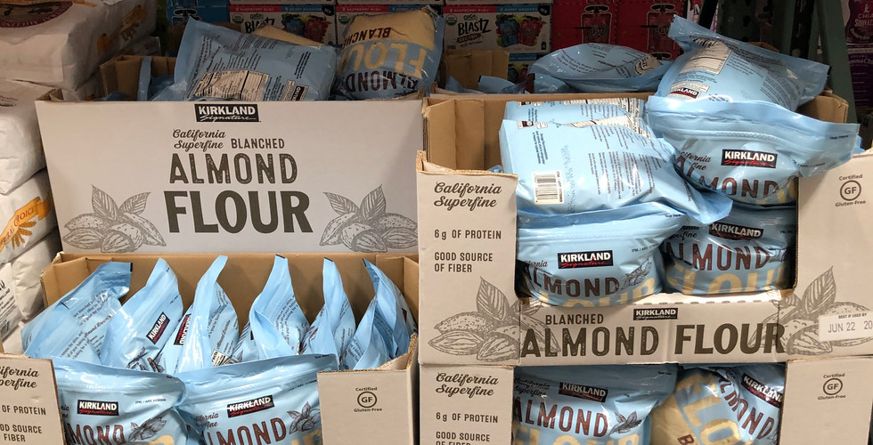
For examples of doing this properly, look no further than well executed packaging of Costco's own in house brand, Kirkland Signature.
Notice when flipping through these photos that that PRODUCT is very clearly called out. "STEAK STRIPS", "SHELLED PISTACHIOS", "ORGANIC STRAWBERRY SPREAD" are called out in large, bold, capital letters which can't be missed.
Once the customer recognized the product it's important to communicate incentive to buy through product imagery. In the case of food, this should make the customer hungry. If you notice, this is a element in the graphics for each Kirkland Signature example shown above.
The final communication is value. This is most commonly done with size of the package. Large bags or multi-bottle packs prove there is no better value than buying at Costco regardless which brand you have been loyal to in the past.
Let's take a look at crackers and cereal from some mega brands:
Product: CHEEZ-IT, GOLDFISH, RITZ, FRUIT LOOPS, RAISIN BRAN all in capital letters.
Imagery: Large product photos.
Value: # of sleeves, cartons, bags is clearly defined.
Imagery and communication of your PRODUCT is critical since the member isn't trying to decide which cheese flavored cracker to buy based on brand, they are trying to decide to buy Cheet-It's vs Ritz.
Let's take a look at electric tooth brushes:
Product: Since they are all electric tooth brushes, "Removes to to 10x plaque", "Removes 400% MORE plaque", "600% more plaque removal", "BACTERIA GUARD" are called out to differentiate from each other.
Imagery: Large product photos or product itself.
Value: Each product clearly shows that each package contains 2 products. This is comparison to an expected 1 product in another retailer.
Examples where we see where improvement may be possible. What do you think?
On your next packaging development project at Costco, consider following Kirkland Signature's lead and sell your PRODUCT at first.
Reach out to us anytime with any questions or advice.
Until next time.
Cheers!
TCPG


![Get ready. Costco's transition to plastic pallets is [not] coming (new content)](https://static.wixstatic.com/media/f18c44_4e75346480b7498f9b2ca7239080825a~mv2.png/v1/fill/w_618,h_414,al_c,q_85,enc_avif,quality_auto/f18c44_4e75346480b7498f9b2ca7239080825a~mv2.png)

Comentários